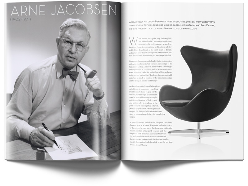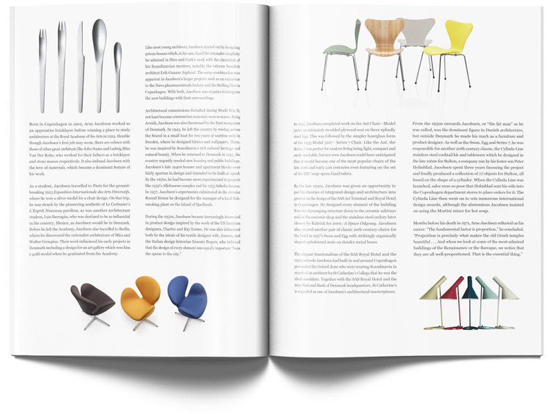


Arne Jacobsen Spread
For one of my favorite classes, my typography class, we were asked to lay out a two-spread magazine article based on a designer from a list of choices. Of course, I chose the man with whom I share a last name. But more importaintly, I had become aquainted with his work the previous summer during a trip to Scandinavia with my brother. After seeing some of Mr. Jacobsen's beautiful pieces in person at the Designmuseum Danmark in Copenhagen, I knew that he would make a great subject of my study.
The display typeface is Neutra Text, and the body text is set in Georgia.
Article text courtesy Design Museum
Images courtesy Fritz Hansen Image Library